- Client
- innogy
- Role
- Lead UX designer
- Timeline
- 7 months
What I did
Led the UX from day one and the cooperation with innogy: research, information architecture, the design system, the energy calculator and user testing.
- UX design
- Design systems
- Google Analytics
- User testing
- Copywriting
- Figma
- Axure RP
- Prototyping
Impact
- more energy calculator completions within three months of launch
- +350%
01
Context and problem
innogy needed a complete redesign and rebrand of innogy.cz, together with a design system that supports modularity and future development.
Energy is an information-heavy service, and the whole site had to lead people towards becoming customers.
02
Research and discovery
I was involved from the very beginning. I studied the company's new vision and how people think about energy and gas: what information they look for and which extra services they might value.
03
Key decisions
- 01
A new information architecture
- Problem
- People come looking for very different things, from prices to the extra services innogy offers.
- Decision
- I created a new information architecture based on what people actually look for.
- Why
- The structure follows how customers think about energy and gas, which the research had mapped.
- 02
One modular design system
- Problem
- A full rebrand had to hold together across many page types and keep up with future development.
- Decision
- 50+ page templates and reusable components, built as one modular system.
- Why
- New pages are assembled from proven parts instead of being designed from scratch.
- 03
An energy calculator at the heart of conversion
- Problem
- Winning new customers online was the main business goal of the redesign.
- Decision
- I designed an energy calculator as the core of the conversion journey.
- Why
- It turns interest into a concrete offer, the step where a visitor becomes a customer.
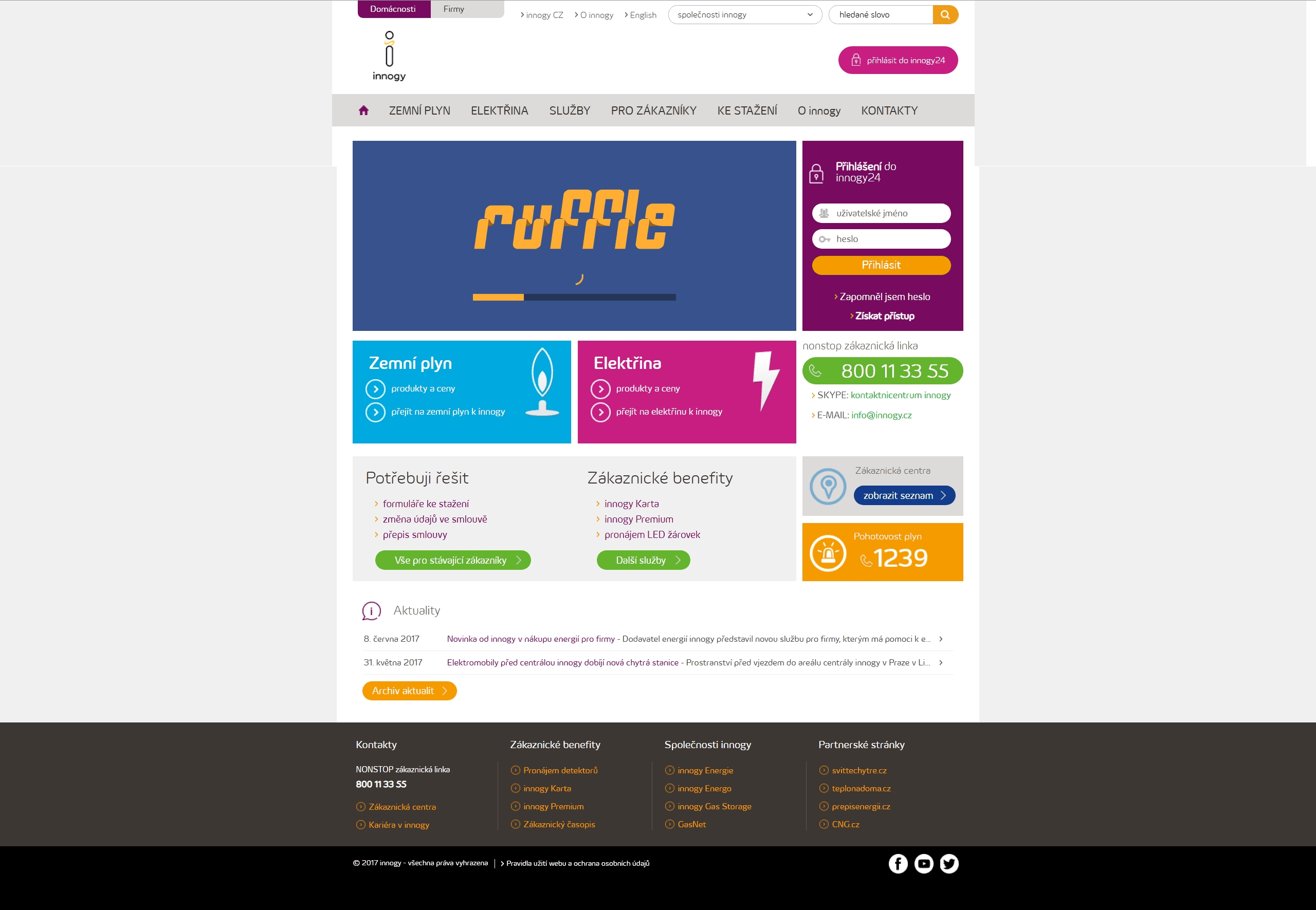
The website
Open the screenshot to see the full homepage.
innogy.cz homepage
04
Validation
I ran the user tests myself, including writing the test script, and gathered further feedback through online forms and A/B tests.
05
Outcome
The modular design system went on to power other innogy websites as well, including Innogy24 and kariera.innogy.cz.
What I learned
Business goals have to be weighed against real empathy for the customer. Even an information-heavy service can feel simple when user needs come first.